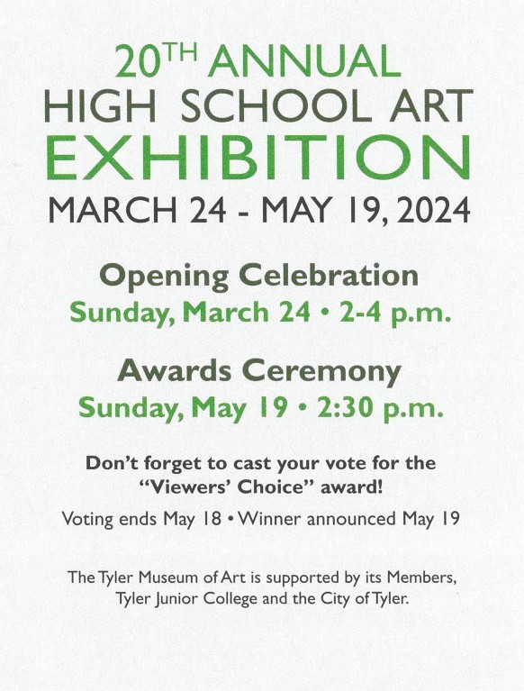
For the past 20 years, the Tyler Museum of Art has exhibited high school artwork from students in the East Texas area. This year, the following schools and teachers have participated in this exhibition:
- All Saints Episcopal School — Teacher: Lisa Horlander
- Bullard High School — Teacher: Rachel Crain
- Chapel Hill High School — Teacher: Jake Arnold
- Chisum High School — Teacher: Mario Munguia
- Christian Heritage School — Teacher: John Martindale
- Cumberland Academy in Tyler — Teacher: Sarah Mays
- Elkhart High School — Teacher: Brandon Franklin
- Frankston High School — Teacher: Elizabeth Lade
- Hawkins High School — Teacher: Trudy Atteberry
- Jacksonville High School — Teacher: Adam Phifer
- Kilgore High School — Teacher: Holly Harper
- Mt. Pleasant High School — Teacher: Laura Kirkland
- Sulphur Springs High School — Teacher: Dr. Phillip Dick
- Tyler High School — Teacher: Kayla Cash
- Tyler High School — Teacher: Norma McClung
- Tyler Legacy High School — Teacher: Mark Anderson
- Tyler Legacy High School — Teacher: Melinda Tefteller
- Whitehouse High School — Teacher: Chelsea Baranski
- Winona High School — Teacher: Chauncy Williams
This lesson examines selected artwork from the 20th Annual High School Art Exhibition to discuss how each piece expresses the Elements and Principles of Design. This lesson was written by Daedalus Boney, a Spring 2024 UT Tyler Intern. It was edited by Rachel Anthony, the Education Manager at the Tyler Museum of Art.
If you use or reference this lesson plan, please leave a comment with your feedback. The lesson plan can be downloaded in the link below.
Elements of Design
Line
An element of design; line is created on a surface with a pointed moving tool. Lines can range in size, width, texture, and presentation. Common types of line are vertical, horizontal, diagonal, zig-zag, and curved.

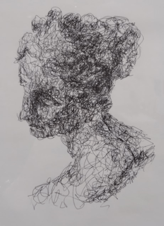
Savana Greb, Aphrodite, Christian Heritage School
In Savana Greb’s work, Aphrodite, line is found in the following locations:
- Lines are used to construct the entire work.
- The lines appear to be randomly applied. Curvilinear strokes give the figure an organic feeling.
- Thicker, darker clusters of lines are used to make the effect of shadows and give the illusion of depth to the figure.
Shape
An element of design; shape is a two-dimensional enclosed space that represents either an organic shape or a geometric shape. Geometric shapes include squares, circles, rectangles, triangles and other standard geometric shapes. Organic shapes include natural non-geometric shapes that are developed from curvilinear lines.

Andi Martinez-Sanchez, Tesserae, Chisum High School
In Andi Martinez-Sanchez’s work, Tesserae, shape is found in the following locations:
- The entire work and the subjects within it are comprised entirely of rectangles.
- The subjects themselves, such as the sun and clouds, are made of larger, organic shapes.
- The rectangles that make up the background of the work have smaller rectangles within them that decrease in size to give the illusion of depth.
Form
An element of design; form is a three-dimensional enclosed space that represents organic and geometric shapes in a third space. Geometric forms include cubes, spheres, triangular prisms, rectangular prisms, and cones. Organic shapes include three-dimensional forms observed in nature, such as trees, rivers, and rocks.

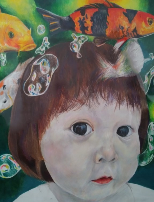
Phuong Nguwen, Lost in Thoughts, Chapel Hill High School
In Phuong Nguwen’s work, Lost in Thoughts, form is found in the following locations:
- The figure and fish in the work are rendered in a realistic, three-dimensional style.
- The use of coloring and shading on the figure and the fish lend to a sense of depth, adding to the three-dimensional look.
- The bubbles floating around the figure and fish are created with organic, curvilinear shapes. Additionally she uses pale blue and pink hues to give the illusion of light reflecting off of them.
Space
An element of design; this term defines the surface area between, before, and behind an object in a composition.

Logan Zahorski, Cosmos, Frankston High School
In Logan Zahorski’s work, Cosmos, space is found in the following locations:
- The work is comprised of the galaxy and black squares that recede into the background to resemble hallways.
- The black squares serve as both building the three-dimensional design and reveal the vastness of space that exists behind the pattern.
- Due to the arrangement of the squares, the center of this ‘hallway intersection’ appears closer to the viewer and the ends of the ‘hallways’ seem to be further.
Color
An element of design; this term defines the pigments used in a painting. Color can be organized into categories, such as: hues, values, complements, and intensity.

Madeleine Fath, Wicked Game, Bullard High School
In Madeleine Fath’s work, Wicked Game, color is found in the following locations:
- The composition expresses a game of cards between two cowboy-like figures.
- The work is comprised mostly of cool colors. The blue and violet hues give a darker, calmer feeling.
- The cool colors are offset by the yellow light emitting from the candle. This creates a contrast between the cool tones of the figures and the warm tones of the flame.
Value
Value is a spectrum applied to a hue. The color can have a dark value or a light hue. This process of changing the value is caused by adding white for light hues and black for dark hues.

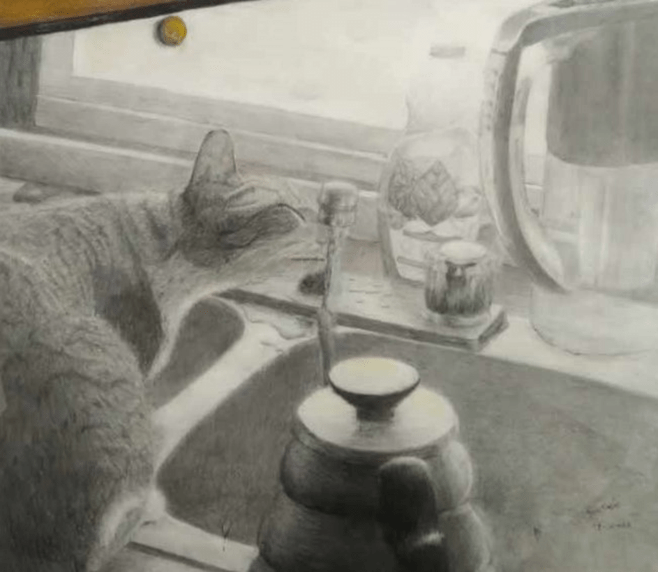
Sora E. Sakai, But One Picture, Winona High School
In Sora E. Sakai’s work, But One Picture, value is found in the following locations:
- This work was made entirely with graphite pencils and coloring pencils, A majority of this artwork was developed using greyscale.
- To give the sense of different colors, the artist uses different values of gray in place of using color.
- Additionally, the artist uses values of gray to imply shadows and texture, giving depth and dimension to the work.
Texture
An element of design; this term defines an artwork’s surface. The artist’s use of the chosen medium creates either implied or actual texture.


Madelyn Harry, Lip Service, Cumberland Academy High School
In Madelyn Harry’s work, Lip Service, texture is found in the following locations:
- The hair, lips, beauty mark, and necklace of the figure have small dollops of paint on them to make them rise off of the canvas. The background has these paint dots as well.
- The dots of paint create the effect of light and shadow in the work.
- The lights hit the tops of the paint dots, creating a shine-like effect.
- The lights also cause a small shadow beneath the paint dots, giving the piece a sense of depth and distance.
Principles of Design
Balance
A principle of design; this term defines the arrangement of the presented imagery with the elements of design. It refers to either asymmetrical compositions or symmetrical compositions.

Taylor Henry, Hiraeth, Tyler Legacy High School
In Taylor Henry’s work, Hiraeth, balance is found in the following locations:
- The work is balanced between the left and right sections, as well as the top and bottom sections.
- The left section shows a wide expanse of land with trees and plant life. In contrast, the right section shows a cliff, a river that divides the two sections, a bridge to connect the sides, and a lone figure atop the bridge.
- The hillside and figure mirror the trees in the left foreground.
- The bottom section of the work shows the rolling landscape and the figure. The top section shows a vast sky with pale, wispy clouds.
- The balance between the different sections of the work helps create visual stability within the compositional elements.
Unity
A principle of design; this term defines how the elements and principles of design are combined within a composition.

Maddie Brooks-Henderson, Art Therapy, Cumberland Academy High School
In Maddie Brooks-Henderson’s work, Art Therapy, unity is found in the following locations:
- This work uses many similar patterns and designs all in black and white.
- The curvilinear lines, organic shapes in this work are not symmetrical. However, the similarities in the patterns, shapes, and colors used in the work unify the composition.
Variety
A principle of design; this term defines the combination of imagery, objects, and ideas in an artwork.

Jackson Turner, American Graffiti, Kilgore High School
In Jackson Turner’s work, American Graffiti, variety is found in the following locations:
- The work was designed using a variety of images from different sources in a collage medium.
- Along with the images coming from different sources, they also display a variety of different images: people, places, objects, and texts.
- The images used in the work also have a variety of sizes. None of the figures are the same size or proportion as the other figures.
- The mixture of these elements and principles exhibits a strong representation of variety.
Emphasis
A principle of design; this term defines the most prominent area in a composition. The viewer’s eye is drawn to this point because the artist used a mixture of the elements and principles of design.

Sekayes Nevayaktewa, Fortune Fulmination Anathema, Jacksonville High School
In Sekayes Nevayaktewa’s work, Fortune Fulmination Anathema, emphasis is found in the primary locations:
- The sunflower and blood placed in the hands has a brighter color than the rest of the work, which is black, white, and grayscale.
- The purposeful use of bright colors in the monochromatic scene emphasizes both the objects and the events that is portrayed.
- The emotional weight of this work is directly tied to the highlighted flower and blood.
Movement
A principle of design; this term defines the visual movement observed in a painting. This can be identified as kinetic movement or implied movement. Additionally, movement can be defined as how the viewer’s eye moves throughout the composition.

Jermia Mitchell, Thoughts, Frankston High School
In Jermia Mitchell’s work, Thoughts, movement is found in the following locations:
- The hearts that stick out on the front of the work are connected by strings, causing the eye to move from one heart to another.
- The hearts themselves are also in front of the painting, making the eyes move back and forth between the hearts in front and the painting in the back.
- The painting has organic, splatter-like shapes drawn into it. Additionally, curvilinear lines and ‘paint drips are present that cause the eye to follow along them.
Pattern
A principle of design; this term defines the repetitive imagery and elements of design found in a composition.


Daren Justice, The Personality of Time, Chisum High School
In Daren Justice’s work, The Personality of Time, pattern is found in the following locations:
- In this work, large spaces of orange and white are filled with small, detailed patterns.
- These patterns help break up large portions of the work into highly detailed sections.
- The patterns also give the work a sense of movement as the eye travels from one pattern to the next.
Proportion
A principle of design; this term defines the comparative size between objects in the composition. It can refer to the imagery within a painting or the size between a sculpture and a real object.


Cicilie Goldsmith, Harmony Haven, Whitehouse High School
In Cicilie Goldsmith’s work, Harmony Haven, proportion is found in the following locations:
- The guitar used for the frame of this work is much larger than the objects inside the guitar.
- The objects inside the guitar are not only much smaller than the guitar itself, they are also smaller than the real versions of the objects.
- Having the life-size guitar to compare the size of the objects adds to the sense of scale.
You can see all of these artworks and more in-person at the Tyler Museum of Art’s current exhibition: 20th Annual High School Art Exhibition. Visit the exhibition page by clicking on the image below.

For more educational resources created by the Tyler Museum of Art, visit our YouTube page by clicking on the YouTube button or clicking the link below.
If you use or references this lesson plan, please leave a comment with your feedback.
Thank you for visiting the Tyler Museum of Art’s Education Blog!


Good work Rachel
<
div dir=”ltr”>
<
blockquote type=”cite”>
LikeLike