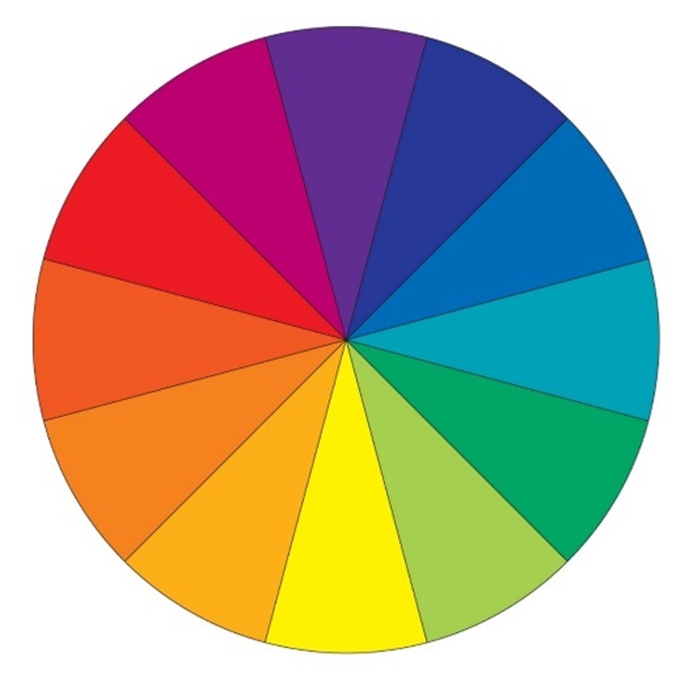
Source for image: https://color.adobe.com/create/color-wheel
The Color Theory: History and Art lesson provides Kindergarten, Middle School, and High School Teachers TEKS, student objectives, questions, art history, and studio art activities. The goal of this lesson is for students to learn about color theory, and create their own color wheel and still life.
If you use or reference this lesson plan, please leave a comment with your feedback. The lesson plan can be downloaded in the link below.
Elementary School TEKS
Kindergarten:
- §117.102.b.1.B
- Foundations: Observation and Perception:
- identify the elements of art, including line, shape, color, texture, and form, and the principles of design, including repetition/pattern and balance, in the environment.
- Foundations: Observation and Perception:
- §117.102.b.2. A / B
- Creative Expression:
- create artworks using a variety of lines, shapes, colors, textures, and forms;
- arrange components intuitively to create artworks;
- Creative Expression:
- §117.102.b.3. A / B
- Historical and Cultural Relevance:
- identify simple subjects expressed in artworks;
- share ideas about personal experiences such as family and friends and develop awareness and sensitivity to differing experiences and opinions through artwork;
- Historical and Cultural Relevance:
- §117.102.b.4.A / B
- Critical Evaluation and Response:
- express ideas about personal artworks or portfolios;
- express ideas found in collections such as real or virtual art museums, galleries, portfolios, or exhibitions using original artworks created by artists or peers;
- Critical Evaluation and Response:
First Grade:
- §117.105.b.1.A / B
- Foundations: Observation and Perception:
- identify similarities, differences, and variations among subjects in the environment using the senses;
- identify the elements of art, including line, shape, color, texture, and form, and the principles of design, including emphasis, repetition/pattern, and balance, in nature and human-made environments.
- Foundations: Observation and Perception:
- §117.105.b.2. A / B
- Creative Expression:
- invent images that combine a variety of lines, shapes, colors, textures, and forms;
- place components in orderly arrangements to create designs;
- Creative Expression:
- §117.105.b.3. A / B
- Historical and Cultural Relevance:
- identify simple ideas expressed in artworks through different media;
- demonstrate an understanding that art is created globally by all people throughout time;
- Historical and Cultural Relevance:
- §117.105.b.4.A / B
- Critical Evaluation and Response:
- explain ideas about personal artworks;
- identify ideas found in collections such as real or virtual art museums, galleries, portfolios, or exhibitions using original artworks created by artists or peers.
- Critical Evaluation and Response:
Second Grade:
- §117.108.b.1.A / B
- Foundations: Observation and Perception:
- compare and contrast variations in objects and subjects from the environment using the senses;
- identify the elements of art, including line, shape, color, texture, form, and space, and the principles of design, including emphasis, repetition/pattern, movement/rhythm, and balance.
- Foundations: Observation and Perception:
- §117.108.b.2. A / B
- Creative Expression:
- express ideas and feelings in personal artworks using a variety of lines, shapes, colors, textures, forms, and space;
- create compositions using the elements of art and principles of design;
- Creative Expression:
- §117.108.b.3. A / B
- Historical and Cultural Relevance:
- interpret stories, content, and meanings in a variety of artworks;
- examine historical and contemporary artworks created by men and women, making connections to various cultures;
- Historical and Cultural Relevance:
- §117.108.b.4. A / B
- Critical Evaluation and Response:
- support reasons for preferences in personal artworks;
- compare and contrast ideas found in collections such as real or virtual art museums, galleries, portfolios, or exhibitions using original artworks created by artists or peers;
- Critical Evaluation and Response:
Third Grade:
- §117.111.b.1. B / C
- Foundations: Observation and Perception:
- use appropriate vocabulary when discussing the elements of art, including line, shape, color, texture, form, space, and value, and the principles of design, including emphasis, repetition/pattern, movement/rhythm, contrast/variety, balance, proportion, and unity;
- discuss the elements of art as building blocks and the principles of design as organizers of works of art.
- Foundations: Observation and Perception:
- §117.111.b.2. A / B
- Creative Expression
- integrate ideas drawn from life experiences to create original works of art;
- create compositions using the elements of art and principles of design;
- Creative Expression
- §117.111.b.3. A / B
- Historical and Cultural Relevance:
- identify simple main ideas expressed in artworks from various times and places;
- compare and contrast artworks created by historical and contemporary men and women, making connections to various cultures;
- Historical and Cultural Relevance:
- §117.111.b.4. A / B
- Critical Evaluation and Response
- evaluate the elements of art, principles of design, or expressive qualities in artworks of self, peers, and historical and contemporary artists;
- use methods such as oral response or artist statements to identify main ideas found in collections of artworks created by self, peers, and major historical or contemporary artists in real or virtual portfolios, galleries, or art museums;
- Critical Evaluation and Response
Fourth Grade:
- §117.114.b.1.B / C
- Foundations: Observation and Perception:
- use appropriate vocabulary when discussing the elements of art, including line, shape, color, texture, form, space, and value, and the principles of design, including emphasis, repetition/pattern, movement/rhythm, contrast/variety, balance, proportion, and unity;
- discuss the elements of art as building blocks and the principles of design as organizers of works of art.
- Foundations: Observation and Perception:
- §117.114.b.2. A / B
- Creative Expression:
- integrate ideas drawn from life experiences to create original works of art;
- create compositions using the elements of art and principles of design; and
- Creative Expression:
- §117.114.b.3. A / B
- Historical and Cultural Relevance:
- compare content in artworks for various purposes such as the role art plays in reflecting life, expressing emotions, telling stories, or documenting history and traditions;
- compare purpose and content in artworks created by historical and contemporary men and women, making connections to various cultures;
- Historical and Cultural Relevance:
- §117.114.b.4. A / B
- Critical Evaluation and Response
- evaluate the elements of art, principles of design, intent, or expressive qualities in artworks of self, peers, and historical and contemporary artists.
- use methods such as written or oral response or artist statements to identify emotions found in collections of artworks created by self, peers, and major historical or contemporary artists in real or virtual portfolios, galleries, or art museums;
- Critical Evaluation and Response
Fifth Grade:
- §117.117.b.1.B / C
- Foundations: Observation and Perception:
- use appropriate vocabulary when discussing the elements of art, including line, shape, color, texture, form, space, and value, and the principles of design, including emphasis, repetition/pattern, movement/rhythm, contrast/variety, balance, proportion, and unity; and
- discuss the elements of art as building blocks and the principles of design as organizers of works of art.
- Foundations: Observation and Perception:
- §117.117.b.2. A / B
- Creative Expression:
- integrate ideas drawn from life experiences to create original works of art;
- create compositions using the elements of art and principles of design;
- Creative Expression:
- §117.117.b.3. A / B
- Historical and Cultural Relevance:
- compare the purpose and effectiveness of artworks from various times and places, evaluating the artist’s use of media and techniques, expression of emotions, or use of symbols;
- compare the purpose and effectiveness of artworks created by historic and contemporary men and women, making connections to various cultures;
- Historical and Cultural Relevance:
- §117.117.b.4. A / B
- Critical Evaluation and Response
- evaluate the elements of art, principles of design, general intent, media and techniques, or expressive qualities in artworks of self, peers, or historical and contemporary artists;
- use methods such as written or oral response or artist statements to identify themes found in collections of artworks created by self, peers, and major historical or contemporary artists in real or virtual portfolios, galleries, or art museums;
- Critical Evaluation and Response
Elementary School Student Goals
- Students will learn about the history of color theory;
- Students will be able to identify and create a color wheel;
- Students will be able to identify complementary colors, tertiary colors, analogous colors, triad colors, warm colors, and cool colors on the color wheel;
- Students will be able to paint a still life, using watercolors, that exhibits either a complementary color mixture, analogous color mixture, warm color mixture or cool color mixture;
- And, students will be able to present their artwork to the class and explain which color harmony they used, what objects they used, and why they chose that color harmony
Middle School TEKS
Art 1:
- §117.202.c.1.B / C / D
- Foundations: Observation and Perception:
- understand and apply the elements of art, including line, shape, color, texture, form, space, and value, as the fundamentals of art in personal artworks using art vocabulary appropriately;
- understand and apply the principles of design, including emphasis, repetition/pattern, movement/rhythm, contrast/variety, balance, proportion, and unity, in personal artworks using art vocabulary appropriately;
- discuss the expressive properties of artworks such as appropriation, meaning, narrative, message, and symbol using art vocabulary accurately.
- Foundations: Observation and Perception:
- §117.202.c.1.A
- Creative Expression:
- create original artworks based on direct observations, original sources, personal experiences, and the community;
- Creative Expression:
- §117.202.c.3.A / B
- Historical and Cultural Relevance:
- identify the influence of historical and political events in artworks;
- identify examples of art that convey universal themes such as beliefs, cultural narrative, life cycles, the passage of time, identity, conflict, and cooperation;
- Historical and Cultural Relevance:
- §117.202.c.4.A / B
- Critical Evaluation and Response
- create written or oral responses to artwork using appropriate art vocabulary;
- analyze original artworks using a method of critique such as describing the artwork, analyzing the way it is organized, interpreting the artist’s intention, and evaluating the success of the artwork;
- Critical Evaluation and Response
Art 2:
- §117.203.b.1.B / C / D
- Foundations: Observation and Perception:
- compare and contrast the elements of art, including line, shape, color, texture, form, space, and value, as the fundamentals of art in personal artworks using vocabulary accurately;
- compare and contrast the principles of design, including emphasis, repetition/pattern, movement/rhythm, contrast/variety, balance, proportion, and unity, in personal artworks using vocabulary accurately;
- understand and apply the expressive properties of artworks such as appropriation, meaning, narrative, message, and symbol using art vocabulary accurately.
- Foundations: Observation and Perception:
- §117.203.b.1.A
- Creative Expression:
- create original artworks that express a variety of ideas based on direct observations, original sources, and personal experiences, including memory, identity, imagination, and the community;
- Creative Expression:
- §117.203.b.3.A / B
- Historical and Cultural Relevance:
- analyze ways that global, cultural, historical, and political issues influence artworks;
- analyze selected artworks to determine contemporary relevance in relationship to universal themes such as belief, cultural narrative, life cycles, the passage of time, identity, conflict, and cooperation;
- Historical and Cultural Relevance:
- §117.203.b.4.A / B
- Critical Evaluation and Response:
- create written or oral responses about personal or collaborative artworks addressing purpose, technique, organization, judgment, and personal expression;
- analyze original artworks using a method of critique such as describing the artwork, analyzing the way it is organized, interpreting the artist’s intention, and evaluating the success of the artwork;
- Critical Evaluation and Response:
Art 3:
- §117.203.b.1. B / C / D
- Foundations: Observation and Perception:
- evaluate the elements of art, including line, shape, color, texture, form, space, and value, as the fundamentals of art in personal artworks using vocabulary accurately;
- evaluate the principles of design, including emphasis, repetition/pattern, movement/rhythm, contrast/variety, balance, proportion, and unity, in personal artworks using vocabulary accurately;
- compare and contrast the expressive properties of artworks, including appropriation, meaning, narrative, message, and symbol, using vocabulary accurately.
- Foundations: Observation and Perception:
- §117.203.b.1.A
- Creative Expression:
- create original artworks expressing themes found through direct observation; original sources; personal experiences, including memory, identity, and imagination; and the community;
- Creative Expression:
- §117.203.b.3.A / B
- Historical and Cultural Relevance:
- analyze ways in which global, contemporary, historical, and political issues have influenced art;
- analyze cultural ideas expressed in artworks relating to social, political, and environmental themes such as environment/nature, conflict and power, relationships to others, and reality/fantasy;
- Historical and Cultural Relevance:
- §117.203.b.4.A
- Critical Evaluation and Response:
- create written and oral responses about personal or collaborative artworks addressing purpose, technique, organization, judgment, and personal expression;
- Critical Evaluation and Response:
Middle School Student Goals
- Students will learn about the history of color theory;
- Students will be able to identify and create a color wheel;
- Students will be able to identify complementary colors, tertiary colors, analogous colors, triad colors, warm colors, and cool colors on the color wheel;
- Students will be able to paint a still life, using watercolors, that exhibits either a complementary color mixture, analogous color mixture, warm color mixture or cool color mixture;
- And, students will be able to present their artwork to the class and explain which color harmony they used, what objects they used, and why they chose that color harmony.
- Optional: Additional Still Life as a Comparison
- Students can create two still life artworks, by choosing two different color harmonies
- The student will create a new still life or reuse their chosen still life to create a new color harmony.
- At the completion of both artworks, the students will present their work to the class, discuss two chosen color harmonies, and explain which color harmony they believe to be more successful.
High School TEKS
Level I:
- §117.302.c.1.B / C / D
- Foundations: Observation and Perception:
- identify and understand the elements of art, including line, shape, color, texture, form, space, and value, as the fundamentals of art in personal artwork;
- identify and understand the principles of design, including emphasis, repetition/pattern, movement/rhythm, contrast/variety, balance, proportion, and unity, in personal artwork;
- make judgments about the expressive properties such as content, meaning, message, and metaphor of artwork using art vocabulary accurately.
- Foundations: Observation and Perception:
- §117.302.c.2.A / D
- Creative Expression:
- use visual solutions to create original artwork by problem solving through direct observation, original sources, experiences, narrations, and imagination;
- create original artwork to communicate thoughts, feelings, ideas, or impressions;
- Creative Expression:
- §117.302.c.3.A / B
- Historical and Cultural Relevance
- compare and contrast historical and contemporary styles while identifying general themes and trends;
- describe general characteristics in artwork from a variety of cultures, which might also include personal identity and heritage;
- Historical and Cultural Relevance
- §117.302.c.4.A / B
- Critical Evaluation and Response
- interpret, evaluate, and justify artistic decisions in artwork by self, peers, and other artists such as that in museums, local galleries, art exhibits, and websites;
- evaluate and analyze artwork using a verbal or written method of critique such as describing the artwork, analyzing the way it is organized, interpreting the artist’s intention, and evaluating the success of the artwork;
- Critical Evaluation and Response
Level II:
- §117.303.c.1.B / C / D
- Foundations: Observation and Perception:
- identify and apply the elements of art, including line, shape, color, texture, form, space, and value, as the fundamentals of art in personal artworks;
- identify and apply the principles of design, including emphasis, repetition/pattern, movement/rhythm, contrast/variety, balance, proportion, and unity in personal artworks;
- explore suitability of art media and processes to express specific ideas such as content, meaning, message, appropriation, and metaphor relating to visual themes of artworks using art vocabulary accurately.
- Foundations: Observation and Perception:
- §117.303.c.2.B / D
- Creative Expression:
- apply design skills in creating practical applications, clarifying presentations, and examining consumer choices in order to make successful design decisions;
- create original artwork to communicate thoughts, feelings, ideas, or impressions;
- Creative Expression:
- §117.303.c.3.A / B
- Historical and Cultural Relevance:
- examine selected historical periods or styles of art to identify general themes and trends;
- analyze specific characteristics in artwork from a variety of cultures;
- Historical and Cultural Relevance:
- §117.303.c.4.A / B / E
- Critical Evaluation and Response:
- interpret, evaluate, and justify artistic decisions in artwork by self, peers, and other artists such as that in museums, local galleries, art exhibits, and websites;
- evaluate and analyze artwork using a method of critique such as describing the artwork, analyzing the way it is organized, interpreting the artist’s intention, and evaluating the success of the artwork;
- select and analyze original artwork, portfolios, and exhibitions to form precise conclusions about formal qualities, historical and cultural contexts, intentions, and meanings.
- Critical Evaluation and Response:
Level III:
- §117.304.c.1.B / C
- Foundations: Observation and Perception:
- compare and contrast the elements of art, including line, shape, color, texture, form, space, and value, as the fundamentals of art in personal artwork;
- compare and contrast the principles of design, including emphasis, repetition/pattern, movement/rhythm, contrast/variety, balance, proportion, and unity, in personal artwork;
- Foundations: Observation and Perception:
- §117.304.c.2.A / B / D
- Creative Expression:
- create original artwork using multiple solutions from direct observation, original sources, experiences, and imagination in order to expand personal themes that demonstrate artistic intent;
- solve visual problems and develop multiple solutions for designing ideas, creating practical applications, clarifying presentations, and evaluating consumer choices in order to make successful design decisions;
- create original artwork to communicate thoughts, feelings, ideas, or impressions;
- Creative Expression:
- §117.304.c.3.A / B
- Historical and Cultural Relevance:
- research selected historical periods, artists, general themes, trends, and styles of art;
- distinguish the correlation between specific characteristics and influences of various cultures and contemporary artwork;
- Historical and Cultural Relevance:
- §117.304.c.4. B / C
- Critical Evaluation and Response:
- evaluate and analyze artwork using a method of critique such as describing the artwork, analyzing the way it is organized, interpreting the artist’s intention, and evaluating the success of the artwork;
- analyze personal artwork in order to create a written response such as an artist’s statement reflecting intent, inspiration, the elements of art and principles of design within the artwork, and measure of uniqueness;
- Critical Evaluation and Response:
Level IV:
- §117.305.c.1.B / C
- Foundations: Observation and Perception:
- compare and contrast the elements of art, including line, shape, color, texture, form, space, and value, as the fundamentals of art in personal artwork;
- compare and contrast the principles of design, including emphasis, repetition/pattern, movement/rhythm, contrast/variety, balance, proportion, and unity, in personal artwork;
- Foundations: Observation and Perception:
- §117.305.c.2.B / D
- Creative Expression:
- evaluate and justify design ideas and concepts to create a body of personal artwork;
- create original artwork to communicate thoughts, feelings, ideas, or impressions;
- Creative Expression:
- §117.305.c.3.A / B
- Historical and Cultural Relevance:
- research and report on selected historical periods, artists, general themes, trends, and styles of art;
- analyze and evaluate the influence of contemporary cultures on artwork;
- Historical and Cultural Relevance:
- §117.305.c.4.A / B / C
- Critical Evaluation and Response:
- develop evaluative criteria to justify artistic decisions in artwork such as that in museums, local galleries, art exhibits, and websites based on a high level of creativity and expertise in one or more art areas;
- evaluate and analyze artwork using a method of critique such as describing the artwork, analyzing the way it is organized, interpreting the artist’s intention, and evaluating the success of the artwork;
- analyze personal artwork in order to create a written response such as an artist’s statement reflecting intent, inspiration, the elements of art and principles of design within the artwork, and the measure of uniqueness;
- Critical Evaluation and Response:
High School Student Goals
- Students will learn about the history of color theory;
- Students will be able to identify and create a color wheel;
- Students will be able to identify monochromatic color scheme, complementary colors, tertiary colors, analogous colors, triad colors, warm colors, and cool colors on the color wheel;
- Students will be able to paint a still life, using watercolors, that exhibits either a monochromatic color mixture, complementary color mixture, analogous color mixture, warm color mixture or cool color mixture;
- And, students will be able to present their artwork to the class and explain which color harmony they used, what objects they used, and why they chose that color harmony.
- Optional: Additional Still Life as a Comparison
- Students can create two still life artworks, by choosing two different color harmonies
- The student will create a new still life or reuse their chosen still life to create a new color harmony.
- At the completion of both artworks, the students will present their work to the class, discuss two chosen color harmonies, and explain which color harmony they believe to be more successful.
- Optional: Supplemental Written Assignment
- Once the still life(s) is completed, the students will write a 1 – 2 page artist statement states their chosen color harmony, why they chose the color harmony, and if they believe their composition(s) is successful.
- The student can read the artist statement during their class presentation of their artwork.
Art Vocabulary

Color Wheel:
- The color wheel contains the twelve colors that are visible to the human eye:
- Red
- Red-Orange
- Orange
- Yellow-Orange
- Yellow
- Yellow-Green
- Green
- Blue-Green
- Blue
- Blue-Violet
- Violet
- Red-Violet
Hue:
- A hue is an alternative name for a color.
Tint:
- A tint is a light value of a hue.
Shade:
- A shade is a dark value of a hue.
Intensity:
- Intensity describe the saturation or the dullness of the color. If the hue is saturated, the color is bright and vibrant. If the hue is dull, the hue has a gray tonality.
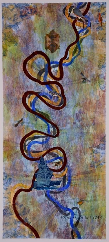
Liz Ward, Ghosts of the Old Mississippi: Baton Rouge to Donaldsville, 2012, watercolor, gouache, graphite, and collage, 72 inches X 32 inches, Tyler Museum of Art, Tyler Texas.
Primary Colors:
- The primary colors are red, yellow, and blue. They are the three main colors that, when blended together, created different colors.
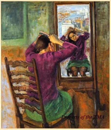
Susan Kahn, Reflections, n.d., oil on canvas, 41.5 inches X 35.5 inches, Tyler Museum of Art, Tyler, Texas.
Secondary Colors:
- Secondary colors are created when two primary colors are mixed together. The following mixtures create secondary colors:
- Yellow + Blue = Green
- Blue + Red = Violet
- Red + Yellow = Orange
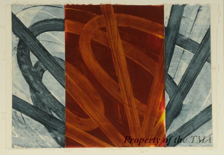
David Row, Untitled (Red), 1997, monotype of handmade paper, 22.75 inches X 22.5 inches, Tyler Museum of Art, Tyler, Texas.
Tertiary Colors:
- Tertiary colors are created when a primary color is mixed with a secondary color. The following mixtures create tertiary colors:
- Red + Orange = Red-Orange
- Red + Violet = Red-Violet
- Yellow + Orange = Yellow-Orange
- Yellow + Green = Yellow-Green
- Blue + Green = Blue-Green
- Blue + Violet = Blue-Violet
Vernon Fisher, Texas Red (Left Panel), n.d., acrylic on canvas, 93 inches X 198 inches, Tyler Museum of Art, Tyler, Texas.
Monochromatic Colors:
- Monochromatic colors create a color scheme comprised of one hue that fades from dark to light colors.
- A monochromatic composition can be created in grayscale. This process requires the artist to begin with the hue of gray. Then, they add white or black to gray to create a spectrum of hues.
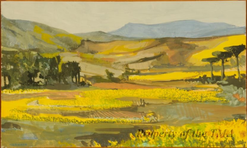
Barnaby John Francis Fitzgerald, Sunflower Fields, 1989, tempera paint on wood, 12 inches X 19.75 inches, Tyler Museum of Art, Tyler, Texas.
Analogous Colors:
- Analogous colors are hues that sit next to each other on the color wheel and share a common color.
Analogous Colors that share Red:
- Blue-Violet
- Violet
- Red-Violet
- Red
- Red-Orange
- Orange
- Yellow-Orange
Analogous Colors that share Blue:
- Red-Violet
- Violet
- Blue-Violet
- Blue
- Blue-Green
- Green
- Yellow-Green
Analogous Colors that share Yellow:
- Red-Orange
- Orange
- Yellow-Orange
- Yellow
- Yellow-Green
- Green
- Blue-Green
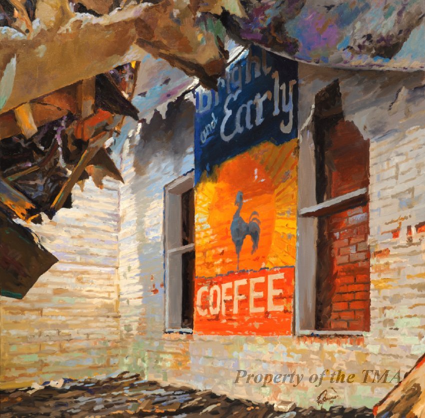
Lee Jamison, Bright and Early, 2019, oil on canvas, 30 inches X 30 inches, Tyler Museum of Art, Tyler. Texas.
Complementary Colors:
- Colors that are opposite of each other on the color wheel.
- When they are placed in close proximity, the two hues make each other look brighter
- Red and Green
- Blue and Orange
- Yellow and Violet
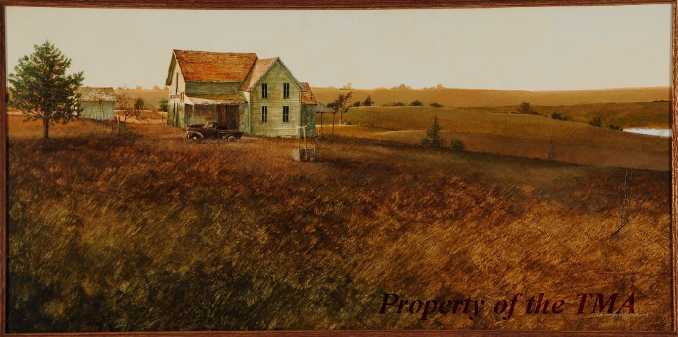
Albino Hinojosa, My Dad’s Chevy, 1978, acrylic paint on Masonite, 19 inches X 37 inches, Tyler Museum of Art, Tyler, Texas.
Warm Colors:
- Warm colors have a bright and warm tonality:
- Red-Violet
- Red
- Red-Orange
- Orange
- Yellow-Orange
- Yellow
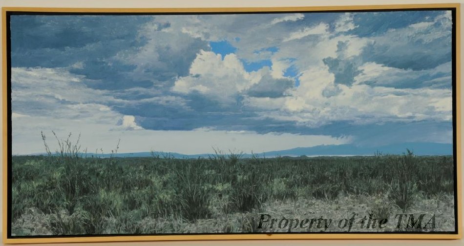
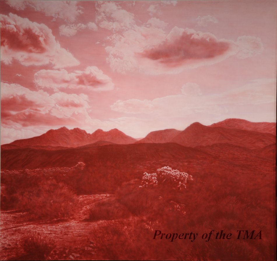
Dennis Blagg, Fresno 1, 1987, oil on board, 15 inches X 30 inches, Tyler Museum of Art, Tyler, Texas.
Cool Colors:
- Cool Colors have a cool and soft tonality:
- Yellow-Green
- Green
- Blue-Green
- Blue
- Blue-Violet
- Violet
Elements of Design
- Artists use the elements of design to create the foundation of the artwork. The elements of art include: line, shape, form, space, color, and texture.
Line:
- An element of design; line is created on a surface with a pointed moving tool. Lines can range in size, width, texture, and presentation. Common types of line are vertical, horizontal, diagonal, zig-zag, and curved.
Shape:
- An element of design; shape is a two-dimensional enclosed space that represents either an organic shape or a geometric shape. Geometric shapes include squares, circles, rectangles, triangles and other standard geometric shapes. Organic shapes include natural non-geometric shapes that are developed from curvilinear lines.
Form:
- An element of design; form is a three-dimensional enclosed space that represents organic and geometric shapes in a third space. Geometric forms include cubes, spheres, triangular prisms, rectangular prisms, and cones. Organic shapes include three-dimensional forms observed in nature, such as trees, rivers, and rocks.
Space:
- An element of design; this term defines the surface area between, before, and behind an object in a composition.
Color:
- An element of design; this term defines the pigments used in a painting. Color can be organized into categories, such as: hues, values, complements, and intensity.
Texture:
- An element of design; this term defines an artwork’s surface. The artist’s use of the chosen medium creates either implied or actual texture.
Principles of Design
- Artists used principles of design to build upon the foundational elements of design. This includes the following: rhythm, movement, balance, proportion, variety, emphasis, and unity.
Rhythm/ Pattern:
- A principle of design; this term defines the repetitive imagery and elements of design found in a composition.
Movement:
- A principle of design; this term defines the visual movement observed in a painting. This can be identified as kinetic movement or implied movement. Additionally, movement can be defined as how the viewer’s eye moves throughout the composition.
Balance:
- A principle of design; this term defines the arrangement of the presented imagery with the elements of design. It refers to either asymmetrical compositions or symmetrical compositions.
Proportion:
- A principle of design; this term defines the comparative size between objects in the composition. It can refer to the imagery within a painting or the size between a sculpture and a real object.
Variety:
- A principle of design; this term defines the combination of imagery, objects, and ideas in an artwork.
Emphasis:
- A principle of design; this term defines the most prominent area in a composition. The viewer’s eye is drawn to this point because the artist used a mixture of the elements and principles of design.
Unity:
- A principle of design; this term defines how the elements and principles of design are combined within a composition.
Resources for Vocabulary
“Complementary Colours.” Tate Modern Museum. Updated 2021. Accessed June 7, 2021. https://www.tate.org.uk/art/art-terms/c/complementary-colours.
“The Elements of Art: Color.” National Gallery of Art in Washington D.C. Updated 2021. Accessed June 7, 2021. https://www.nga.gov/education/teachers/lessons-activities/elements-of-art/color.html.
Ragan, Rosalins. “Elements of Art.” In Art Talk, 61 – 211. Edited by Bennett and McKnight Division. San Francisco: Glencoe Publishing Company, 1988.
Ragan, Rosalins. “The Principles of Design.” In Art Talk, 211 – 347. Edited by Bennett and McKnight Division. San Francisco: Glencoe Publishing Company, 1988.
“Teaching Resources: Colour and Shape.” Tate Modern Museum. Updated 2021. Accessed June 7, 2021. https://www.tate.org.uk/art/teaching-resource/colour-and-shape.
History of Color Theory
Sir Isaac Newton
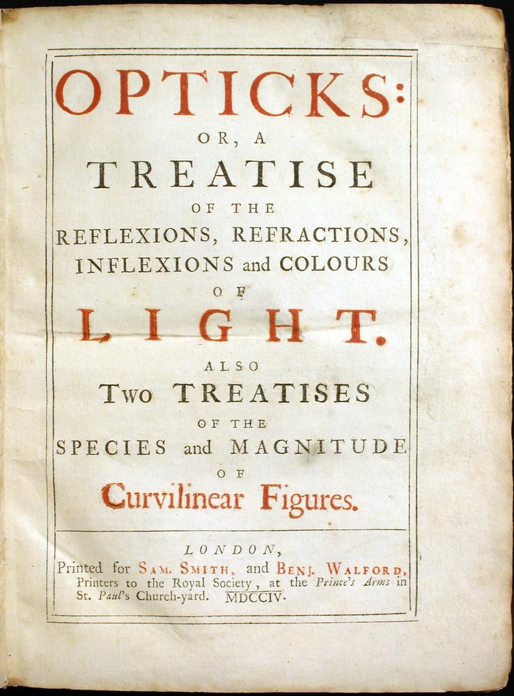
- Newton published his theory of color in his book Opticks, which was first published in 1704.
- His research of color was based on prisms and the manner in which light is refracted in the prism.
- He stated that all light is white and, when passed through a prism, the following colors are refracted: red, orange yellow, green, blue, indigo, and violet.
- This color spectrum set the standard for the ROYGBIV system used in modern art.
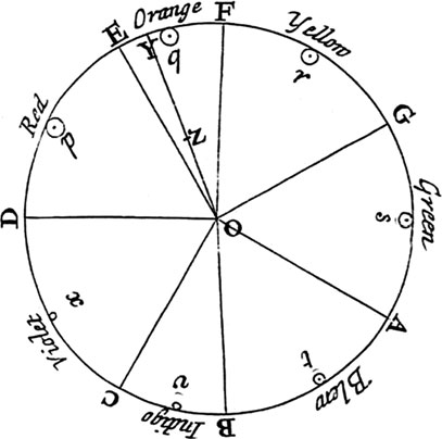
- Due to his findings, Newton created this color wheel.
- Each of the “pie-slices’ are uneven, which reflects his observation that the most prominent colors in the refraction were yellow, green, blue, violet, and red.
- The small section between red and orange was classified as a mixture of the two hues to create a red-shift tonality of red-orange.
- This is the only instance within Newton’s theory that he states that colors observed through light can be mixed to create a new color.
- Though it is not necessarily applicable to traditional artists, this method of mixing light is often used by digital media artists who project their artwork on differing surfaces.
- This color wheel was not indented for artists. Instead, it was designed to catalog how light reacts when refracted through a prismatic device.
- However, his theory of color and the resulting color wheel helped inspire subsequent color theorists to expand on his findings to apply emotional and scientific meanings to perceived color.
- Each of the “pie-slices’ are uneven, which reflects his observation that the most prominent colors in the refraction were yellow, green, blue, violet, and red.
Michel Eugène Chevreul
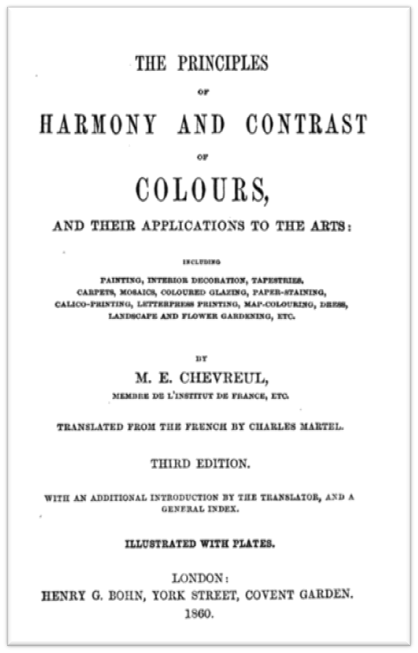
- Chevreul published his color theories in his book De la Loi de contraste simultané des couleurs (translated as: The Principles of Harmony and Contrast of Colours, and their Applications to the Arts), in 1839.
- His primary theory, which relied on Newton’s experiments with refracted light, stated that each visible color on the color wheel has a complementary color that exists opposite of the hue on the wheel.
- The complementary color are:
- Blue and Orange
- Yellow and Violet
- Red and Green
- Each primary hue is paired with a secondary color, which is comprised of the other two primary colors.
- The complementary color are:
- He stated that this effect can be both beneficial and detrimental to an artist.
- The benefit:
- With a matching complement, the artist can brighten their composition by either incorporating small ‘pops’ of the complement or using the complementary color as a shadow to create a visually interesting object.
- A key example is mixing green and red to create a shadow on a red apple. The mixture color will create a warm brown-grey hue that will both brighten the apple and avoid dulling the red hue with a neutral hue.
- The detriment:
- Using complementary color in a composition will cause the surrounding neutral pigments to either appear brighter or duller in comparison.
- For example: if yellow and violet are used on a brown background, then the yellow will cause the brown to appear chromatically red in tonality while the violet will cause the brown to appear chromatically orange in tonality.
- The effect is a brown pigment that visually appear to be a dull mixture of red and orange.
- The benefit:
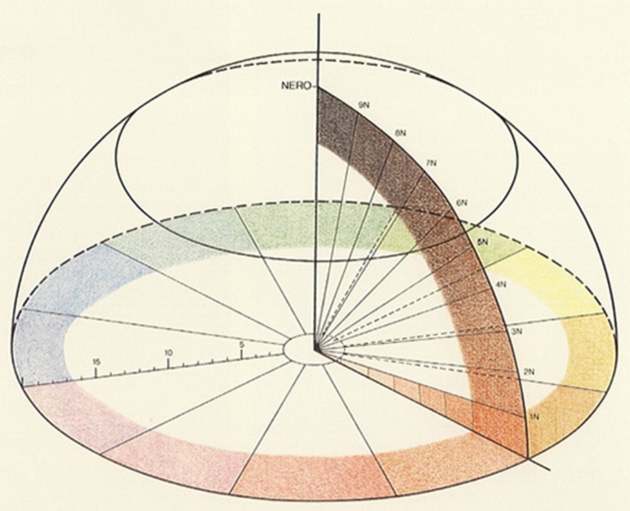
- In addition to the two-dimensional color wheel, Chevreul added a three-dimensional element to his theory.
- He stated that at the base level, meaning the pure color perceived from light, color is at its most saturated state.
- As the three-dimensional wheel moves up in space, the color becomes darker until it is almost black.
- Likewise, as the three-dimensional wheel moves across the two-dimensional plane towards the center, the hue becomes lighter until it is almost white.
- Chevreul’s depiction of the range of saturation in a pigment helps clarify how color can be manipulated in color theory.
Charles Blanc
- Blanc originally published his color theory in his book Grammaire des arts du dessin (translated as The Grammar of Painting and Engraving) in 1870.
- His color theory applied an emotional context to the color wheel, encouraging the artist to capture the ‘essence’ of nature in a composition.
- He believed that an artist should be inspired by the natural phenomenon and try to capture the unique colors within atmospheric effects, such as rain, light, and fog.
- The artist should not be chained to perfectly capturing the observed effect. Instead, the artist should use the natural phenomena as a reference to use colors that simulate the effect of fog, rain, or light.
- This idea was commonly used by the Impressionists and Neo-Impressionists, such as Claude Monet and Georges Seurat.
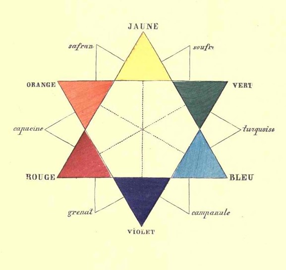
- Blanc’s color wheel arranges the six colors into a star pattern, removing the hue of indigo.
- Inside the star are lines that connect the complements together, referring to Chevreul’s color theory.
- The hues are labeled in French and, between each triangle, are the labeled tertiary colors made from a mixture of a secondary and primary color.
- Due to his interest in connecting color to nature, his color wheel simply divides each hue as a separate entity, encouraging the artist to use the separated hue to create natural compositions.
- Blanc’s final color concept discussed how pigments should be arranged next to one another on the composition to cause the eye to visually blend the hues.
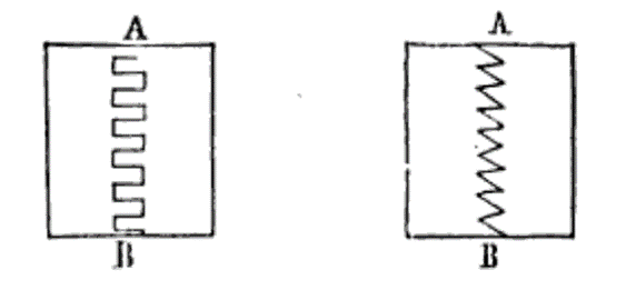
- The above diagram shows four of his color placements examples:
- The top-left shape divides the hues with a rectangular ‘zipper’ pattern.
- The effect causes the two sections to appear mechanically connected.
- If two complements were placed in either form and divided by the rectangular pattern, the eye would identify a visual distinction between the two pigments.
- The top-right shape divides the hues with the traditional zig-zag pattern.
- This causes the two sections to have more energy.
- The eye follows the jagged line down the shape and recognizes the electric and energized effect.
- If the artist placed two complements in this formation, the eye would begin to visually blur the two colors together.
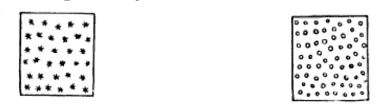
- The bottom-left and bottom-right shapes both depict a square with dots that are separated with space.
- The major difference between the two shapes is the amount of space around each dot: the left square has more space the right square.
- There are two color methods that can be used with these patterns.
- The first is that the square is one complement, and the dots are the matching complement.
- This arrangement will cause the eye to see the dots as an overtone, allowing the eye to optically apply a ‘transparent’ complementary hue over the square pigment.
- The second arrangement is that the square is white, but the dots are randomly alternating between two complements.
- This method would create a ‘static’ effect, where the eye visual blends the two colors together to visually create a new color mixture.
- The first is that the square is one complement, and the dots are the matching complement.
- The top-left shape divides the hues with a rectangular ‘zipper’ pattern.
- The above diagram shows four of his color placements examples:
- Blanc’s interest in nature, paired with his fascination with color placement, enabled him to create a color theory that asked the artist to examine their surroundings and replicate the chromatic effects using unique color placements.
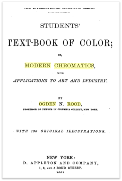
Ogden Rood
- Rood published his color theories in his book Students’ Textbook of Color or Modern Chromatics with Applications to Art and Industry in 1881.
- Differing from Blanc’s perception of color, Rood believed that color was rooted in scientific study.
- He was fascinated with how the eye could perceive any form of light and break the light waves apart into separate hues via the cone receptors in the human eye.
- His thesis is primarily based in experimenting with different light sources, looking at a single point of light from multiple different angles, and mixing pigments to find definitive formulas for artists to use when mixing colors.
- His ideas, though based in science methods, rely heavily on Newton’s prismatic experiments.
- Rood believed, as did Newton, that all light was white light.
- Thus, you could theoretically add percentages of separated pigments to return to the white hue.
- This resulted in the following equation:
35.46 red + 33.76 green + 29.79 blue = white
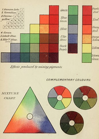
- Blanc’s color wheel is separated into three different categories.
- The standard color wheel, which is in the shape of a triangle, presents red, orange, yellow, green, blue, and violet blending into each other.
- The color wheel provides a clear transition between each pigment as it slowly becomes a new hue.
- Next to the color wheel are three circles labeled complementary colors.
- Each wheel becomes darker, expressing how the reduction of saturation can affect the complementary colors.
- Additionally, his complementary scale pairs orange with dark green, and yellow with blue. In his color theory, he believed these hues were the ‘true’ complements based on the light waves detected in his experiments.
- At the top of the sheet, Rood created an increment chart that exhibited violet, blue, green, yellow, orange, and red.
- Next to the graph, he explained that he steadily mixed pigments together to create a range of color mixtures.
- The purpose was to provide a chart for artists to reference when mixing colors.
- These colors correlate with the many equations he refers to throughout his book.
- Next to the graph, he explained that he steadily mixed pigments together to create a range of color mixtures.
- The standard color wheel, which is in the shape of a triangle, presents red, orange, yellow, green, blue, and violet blending into each other.
- Some of Rood’s other color formulas intended for artists are the following:
- WX + YX = (a new color)
- W = White
- X = One color
- Y = A different color than Y
- For Example: (White x (Red)) + ((Blue) x (Red)) = pastel red-violet
- ZX + YX = (a new color)
- Z = One color
- X = A different color than Z
- Y = A different color than Z and X
- For Example: ((Green) x (Blue)) + ((Red) x (Blue)) = blue-gray
- WX + YX = (a new color)
Resources for Color Theory
Blanc, Charles. The Grammar of Painting and Engraving. Translated by Kate Newell Doggett. New York: Cambridge Riverside Press, 1874. https://www.google.com/books/edition/The_Grammar_of_Painting_and_Engraving/qNVAAAAAYAAJ?hl=en&gbpv=1&dq=charles+blanc+grammar+of+painting&printsec=frontcover.
Chevreul, Michel Eugène. The Principles of Harmony and Contrast of Colors and their Applications to the Arts. Translated by Charles Martel. London Henry G. Bohn, York Street, Covent Garden, 1860. https://www.google.com/books/edition/The_Principles_of_Harmony_and_Contrast_o/LIMOAAAAQAAJ?hl=en&gbpv=1&dq=michel+eugene+chevreul&printsec=frontcover.
Kemp, Martin. “Chapter VII: Newton and After.” In The Science of Art: Optical Themes in Western Art from Brunelleschi to Seurat. New Haven and London: Yale University Press, 1990.
Newton, Sir Isaac. Opticks: or a Treatise of the Reflections, Refractions, Inflections, and Colours of Light. London: Royal Society Prints, 1701. https://www.google.com/books/edition/Opticks/mxhfAAAAcAAJ?hl=en&gbpv=1&dq=isaac+newton+opticks&printsec=frontcover.
Rood, Ogden. Students Text-Book of Color; of Modern Chromatics with Applications to Art and Industry. New York: D. Appleton and Company, 1881. https://www.google.com/books/edition/Students_Text_book_of_Color/ms4LAAAAYAAJ?hl=en&gbpv=1&dq=ogden+rood+modern+chromatics&printsec=frontcover.
Elementary School Art Activities
Questions for Elementary School Students:
- Discuss the color wheel and the color harmonies. Ask the students to identify color harmonies they encounter in daily life.
- Discuss the color theories. Ask the students: Which color theory do you personally agree with? Explain your answer.
- Is color theory important in art? Explain your answer.
- Can an artist create an interestng artwork without using color? Why or why not?
- What is a still life?
Activity: Elementary School Fine Arts
- Activity Setting: Classroom
- Materials: Watercolor, watercolor paper, watercolor brushes, water cup, painters’ tape, pencil, still life objects
- Subject: Color, Painting, Sketching
- Texas TEKS: Kindergarten, First Grade, Second Grade, Third Grade, Fourth Grade, and Fifth Grade
- Duration: Extended Project
The students will create a watercolor still life. Either provide different objects for the students to choose, or allow the students to bring two – three objects to paint. The key topic is for the students to paint a color harmony on the still life drawing. The harmonies can include: monochromatic, complementary. analogous, primary (triad), warm and cool color harmonies. Have the student sketch their still life with a pencil. Afterwards, the students will begin painting their still life. This project may take between 2 – 3 weeks.
After the project is completed, hold a class discussion/ presentation where the students explain their chosen color harmony, their objects, and how they arranged the still life to complement the color harmony.
Middle School Art Activities
Questions for Middle School Students:
- Discuss the color wheel and the color harmonies. Ask the students to identify color harmonies they encounter in daily life.
- Discuss the color theories. Ask the students: Which color theory do you personally agree with? Explain your answer.
- Is color theory important in art? Explain your answer.
- Can an artist create an interestng artwork without using color? Why or why not?
- What is a still life?
Activity: Middle School Fine Arts
- Activity Setting: Classroom
- Materials: Watercolor, watercolor paper, watercolor brushes, water cup, painters tape, pencil, still life objects
- Subject: Color, Painting, Sketching
- Texas TEKS: Art 1, Art 2, Art 3
- Duration: Extended Project
After introducing and discussing color theory and the color harmonies to the students, have the students create their own color wheel with watercolor paint. This will be used as a reference for the following project. Once the color wheel is completed, the students will use a second sheet of paper to paint the discussed color harmonies. The student will write the color harmony, then paint the color associated with the color mixture. The color wheel and the color harmony sheet will be used as references for the following assignment.
The students will create a watercolor still life. Either provide different objects for the students to choose, or allow the students to bring two – three objects to paint. The key topic is for the students to paint a color harmony on the still life drawing. The harmonies can include: monochromatic, complementary. analogous, primary (triad), warm and cool color harmonies. Have the student sketch their still life with a pencil. Afterwards, the students will begin painting their still life. This project may take between 2 – 3 weeks.
After the project is completed, hold a class discussion/ presentation where the students explain their chosen color harmony, their objects, and how they arranged the still life to complement the color harmony.
- Optional: Additional Still Life as a Comparison
- Students can create two still life artworks, by choosing two different color harmonies
- The student will create a new still life or reuse their chosen still life to create a new color harmony.
- At the completion of both artworks, the students will present their work to the class, discuss two chosen color harmonies, and explain which color harmony they believe to be more successful.
High School Art Activities
Questions for High School Students:
- Discuss the color wheel and the color harmonies. Ask the students to identify color harmonies they encounter in daily life.
- Discuss the color theories. Ask the students: Which color theory do you personally agree with? Explain your answer.
- Is color theory important in art? Explain your answer.
- Can an artist create an interestng artwork without using color? Why or why not?
- What is a still life?
Activity: High School Fine Arts
- Activity Setting: Classroom
- Materials: Watercolor, watercolor paper, watercolor brushes, water cup, painters tape, pencil, still life objects
- Subject: Color, Painting, Sketching
- Texas TEKS: Art Level I, Level II, Level III, and Level IV
- Duration: Extended Project
After introducing and discussing color theory and the color harmonies to the students, have the students create their own color wheel with watercolor paint. This will be used as a reference for the following project. Once the color wheel is completed, the students will use a second sheet of paper to paint the discussed color harmonies. The student will write the color harmony, then paint the color associated with the color mixture. The color wheel and the color harmony sheet will be used as references for the following assignment.
The students will create a watercolor still life. Either provide different objects for the students to choose, or allow the students to bring two – three objects to paint. The key topic is for the students to paint a color harmony on the still life drawing. The harmonies can include: monochromatic, complementary. analogous, primary (triad), warm and cool color harmonies. Have the student sketch their still life with a pencil. Afterwards, the students will begin painting their still life. This project may take between 2 – 3 weeks.
After the project is completed, hold a class discussion/ presentation where the students explain their chosen color harmony, their objects, and how they arranged the still life to complement the color harmony.
- Optional: Additional Still Life as a Comparison
- Students can create two still life artworks, by choosing two different color harmonies
- The student will create a new still life or reuse their chosen still life to create a new color harmony.
- At the completion of both artworks, the students will present their work to the class, discuss two chosen color harmonies, and explain which color harmony they believe to be more successful.
- Optional: Supplemental Written Assignment
- Once the still life(s) is completed, the students will write a 1 – 2 page artist statement states their chosen color harmony, why they chose the color harmony, and if they believe their composition(s) is successful.
- The student can read the artist statement during their class presentation of the artwork.
Teacher Resources from the
Tyler Museum of Art
- TMA Art Education Blog: https://tylermuseum.art/
- TMA Education YouTube Channel: https://www.youtube.com/channel/UCxut2kfUh_uO-RIQWVFzXPg/videos
- Education Manager:
- (903)-595-1001
For more educational resources created by the Tyler Museum of Art, visit our YouTube page by clicking on the YouTube button or clicking the link below.

If you use or references this lesson plan, please leave a comment with your feedback.
Thank you for visiting the Tyler Museum of Art’s Education Blog!

One thought on “Color Theory: History and Art”